Since we started the Tracery Blog last spring, we’ve received a lot of questions about the paint colors used in many of the photographs of our work that we’ve shared. We’ve always been a little reluctant to reveal too many details about projects we’ve completed–our wonderful clients pay us to make selections for them and we want to be respectful of that and not give too much away. We do understand though how difficult it is to find really great paint colors (or faucets, or light fixtures, or tile) so today we bring you the first installment in a new series, [tracery tips]
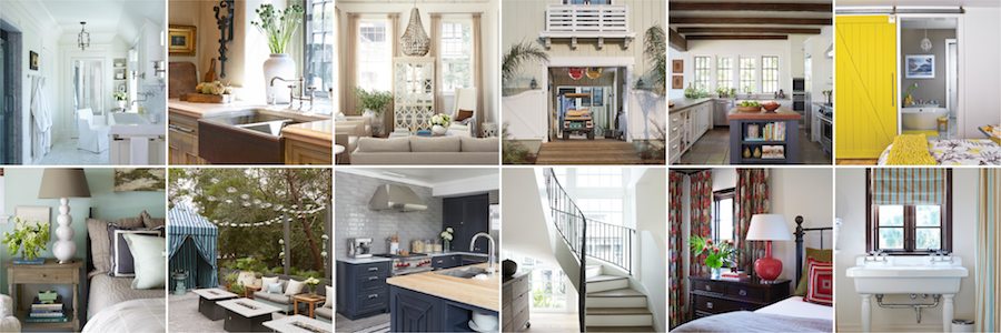
A quick review of our work will reveal that more often than not, we prefer neutral paint colors. That’s not to say we don’t love a colorful space from time to time, but we tend to prefer adding color through artwork, a pillow or a well-selected piece of colorful furniture. Today we want to share our favorite basic neutrals: the best white, the best natural, a wonderful charcoal, a solid chocolate and basic black.

We’ve been known to use pure white from time to time, but most of the time our go to white is Benjamin Moore’s ‘China White’ (#I-74)
China White has just a touch of grey to it, which makes it sophisticated and calm, and helps it avoid being too glaringly white. We’ve used this color, a lot….several clients’ homes, the Birmingham office we share with Dungan Nequette and The G Brand and Doug’s own house all sport China White. We’re about to have our Rosemary Beach shop repainted China White as well. When doing an all white room, we like to paint the walls, trim and ceiling all the same–it helps make the space feel huge!
—

You’d think it would be easy, but finding the perfect natural color for walls can be very difficult. Almost everyone has lived in an apartment at some point with supposedly neutral walls that were too pink, too peach or too vanilla. Our preferred color in a situation where we want walls that aren’t white, but aren’t anything else either is Benjamin Moore’s ‘Grant Beige’ (#HC-83).
Grant Beige is the color of linen. It’s just slightly grey, but never picks up any other color…it’s great when paired with another basic like white, chocolate or black but also works well with color. It’s a wonderful, serene color and works every time we try it.
—

Charcoal grey continues to be everyone’s new favorite color. After much experimentation last year (in which a certain kitchen island was repainted no fewer than three times!) we finally found the perfect charcoal, Benjamin Moore’s ‘Kendall Charcoal’ (#HC-166).
We’d consider charcoal grey to be a generally cool color, but there’s something very warm about this shade. We love it so much, in fact, we chose Kendall Charcoal as the basis for the new charcoal color scheme we adopted for our brand identity late last year.
—

Chocolate brown can get green, or worse red, if you aren’t careful. We think Benjamin Moore’s ‘Otter Brown’ (#2317-10) is great because it does neither. It is chocolate, pure and simple.
Pair it with Grant Beige and you’ll have a very sharp combination for sure. We’ve used this color inside a lot, but have also had great success with it as an exterior trim color. Colors often change a lot when transferred outdoors but Otter Brown looks great in either setting.
—

Paint color names can get a little ridiculous, so the simplicity of this one is hard to argue with…Benjamin Moore ‘Black’ (#2132-10)
Pure black is crisp and sophisticated, and this shade won’t get blue or green when combined with a bright accent. Use it with China White and you’ll have a classic combination that will never go out of style.
[color swatches via Decorati]


Thank you so much for posting this! I’m looking for a good chocolate brown and a gray now and it’s good to know that you’ve used these repeatedly and still like them.
LikeLike
Thanks for sharing. I think I’m going to paint a bookshelf Kendall Charcoal. Great color.
LikeLike
This is a MONEY post, that I am sure many people (including myself) will refer back to again and again. I look forward to everything this series will bring! Thanks, Tracery!
LikeLike
Love all these colors! I find I keep going back to the same colors again and again!
LikeLike
thank you- thank you- getting ready to paint tomorrow and have not decided the exact color i wanted but it helps to know that these are tried and true
LikeLike
I love all of these colors. I added you to my blog roll and gave you a shout out on my blog since I just had to share you to my fellow bloggers. Can’t wait to see more of you. Happy New Year, Heidi
LikeLike
Thank you for sharing. I can certainly appreciate your desire for privacy in design selections. I actually enjoy the mystery of researching the elements of an interior and where everything came from. Paint color, however, is one that is virtually impossible to figure out from a photo.
I’m really looking forward to seeing more tips. Again, thank you for sharing with everyone. I think you’ll find you’ll get more than you give with the tips on the blog. With the proliferation of information on the Internet and elsewhere it’s hard to have “secret sources” anymore. To me one of the key reasons you hire an interior designer is the magic they can create by pairing things together in the just the right way. They might use several elements that are well known, but the designer can elevate them by pairing them correctly.
LikeLike
Needed this post last week! Spent most of the holidays painting a bedroom after changing my mind three times on the color choice…wanted a white with grey base… finally went with Ralph Lauren Brilliant White to prevent getting something with a yellow tint. It’s white! Like it, but will try your China White in the living area. Husband just keeps wondering how picking a shade of white can be so difficult! Love the Kendall Charcoal, too. Thanks for sharing…you guys are the best!
LikeLike
thank you SO much for sharing these colors. paint is incredibly hard for me and i’m always questioning my choices. we’ll be painting a new space this summer and i’ve tucked this post away for that time.
i just want to say that i appreciate and am looking forward to this new series. i know your clients pay you for your ideas and genius decorating and designing talents. thank you for sharing with someone like me who isn’t in a place to take the plunge and hire ya’ll but adores your style {and is still finding my own!}.
LikeLike
Paint colors are tough! Thanks for these tips. I love getting suggestions on Ben Moore colors, and I also stick with neutrals.
LikeLike
Haven’t noticed Benjamin Moore paints for sale in the UK though I m sure they ll be around somewhere. Is it a big National brand or a niche company ie like Farrow and Ball? Talking of F&B do you use them at all in your work?. Their colours seem to suit the UKs climate and light.I have a real problem with people in the UK using ‘fashionable’ colours such as the YSL mediterranean blue which looks atrocious in our light and should be avoided at all costs! Here in the UK we also seem to have a fierce loyalty to painting all woodwork in white gloss, which seems so dull.Even my husband can’t seem to break away from its powerful hold. However, this year will be different I am rebelling and will begin the gradual tranformation of my house!
ZoeB
LikeLike
Yes, we’ve used Farrow & Ball a couple of times…we have to order it from Atlanta. It’s a completely different consistancy and finish from ‘American’ paint and we think it’s worth the money. That being said, we’ve had their colors mixed in less expensive Benjamin Moore and Sherwin Williams’ bases before too.
LikeLike
Great post. Question: what colors do you recommend for painted cabinetry? For example, I love the black (espresso?) and white kitchen you did for the Atlanta family’s FL home. Would you share what you used there? Thanks!
LikeLike
Danielle,
Out of respect for our clients, we don’t disclose paint colors, fabric names, etc for specific projects. We will say that we’ve painted base cabinets in both the Black and Otter Brown colors we recommend in this post. For lighter upper cabinets we often like to match them to the wall color–just as we typically do with casing, baseboard, doors, etc. It really helps make the space feel bigger and keeps upper cabinets from feeling so ‘in your face’
Hope that’s helpful!
LikeLike
My living and dining rooms are Grant Beige and you’re spot-on, it’s the perfect not-white neutral. Not a hint fleshy-pink! It recedes, but is still warm. Love China White, too — about to paint my kitchen!
LikeLike
Pingback: [tracery tips] perfect pedestals « Tracery Interiors Blog
Great colors! Benjamin Moore is my fave too. They’re just so classic! Huge fan of grant beige.. These posts are not only helpful for homeowners but for designers as well! Thanks for sharing… xoRH
LikeLike
Thank you for this post. I really admire your firm’s work.
I am also a huge fan of Grant Beige and look forward to trying the others. Have you seen Kendall Charcoal used effectively in a small space without natural light? Just curious if it gets too dark for a situation like that….can’t wait to sample it!
LikeLike
I painted my living room benjamin moores coventry grey and was looking for a color for my dining room( that you can see from the living room) do you think that the kendall charcol would flow nicely with that?
LikeLike
I have searched for the perfect gray and decided to use basic gray oc 23–it does not seem to change color much.There doesn’t seem to be much gray in it from the sample so I was wondering if it appears more gray after the walls are painted. Will the kendall charcol look ok with this as to compliment another wall? Thanks
LikeLike
I’m currently struggling to find a neutral. I’ve tried so many and grant beige I really like BUT in the evening it looks very light gray which I don’t like. Any suggestions? If I asked the paint store to darken it would that help?!?
LikeLike
Is there a certain trim paint you recommend to pair w Grant Beige? Do you think it would look good to do all the trim Grant Beige also?
LikeLike